


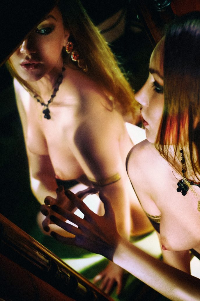
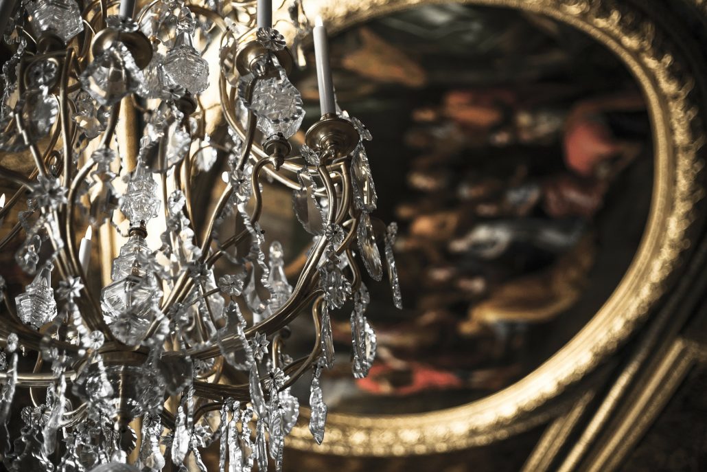
There’s a clear spectrum of colour logic, which comes about because of the way we see. The pictures below, one by Caravaggio and one by Rembrandt, are excellent examples of my leading inspiration: dark shadows and brilliant flashes of strong primary colour. In photography this style would be known as “low-key”. It’s easy to characterise physiologically. We have three colour receptors in our eyes, red, green, and blue. Black is the “colour” we see when none of these receptors is triggered. When just one is, we see something as red, or as green, or as blue. These are the “primary colours”.


For psychological reasons that as far as I know are not fully understood, we also tend to see yellow as a “primary”. But only when it’s bright. Dark yellow is the colour we call “brown”.
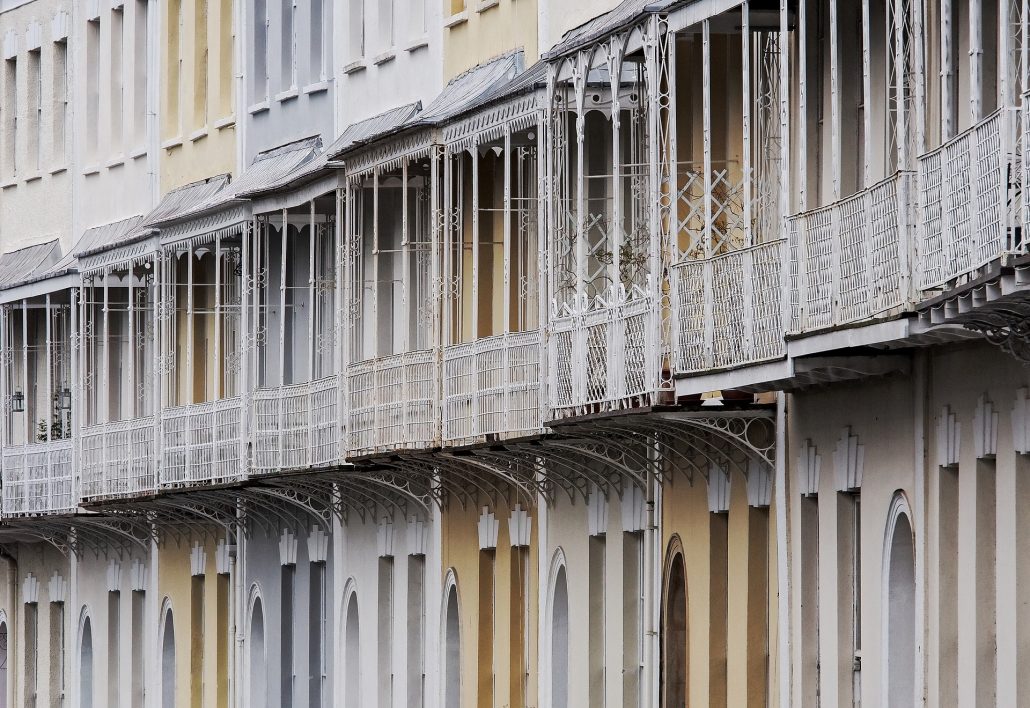
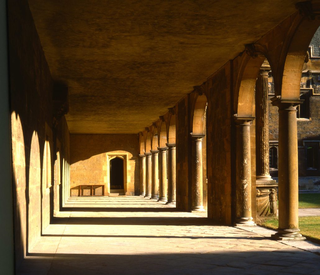
The contrasting style is “high-key”, and I illustrate this with two photographic images from elsewhere on this site. It’s a look that has been substantially developed in photography, partly for reasons I’ll discuss in a minute, and examples from painting are rare.


This works the opposite way, coming down from the state where all three receptors are activated, which is what we call the “colour” white. At the next level down from white we have just two receptors triggered, and technically these “secondary colours” are known as cyan (blue and green triggered), yellow (red and green) and magenta (red and blue). Because printing works starting with white paper, and applying inks of these three secondary colours, printing is always cheaper on ink, and easier to get right, in high-key images. Indeed, getting a good black in printing is well-nigh impossible and for serious “art” printing special techniques are needed. I have an excellent example in a book on Yves St-Laurent, which cost a fortune when new, and where you can actually feel the black areas.
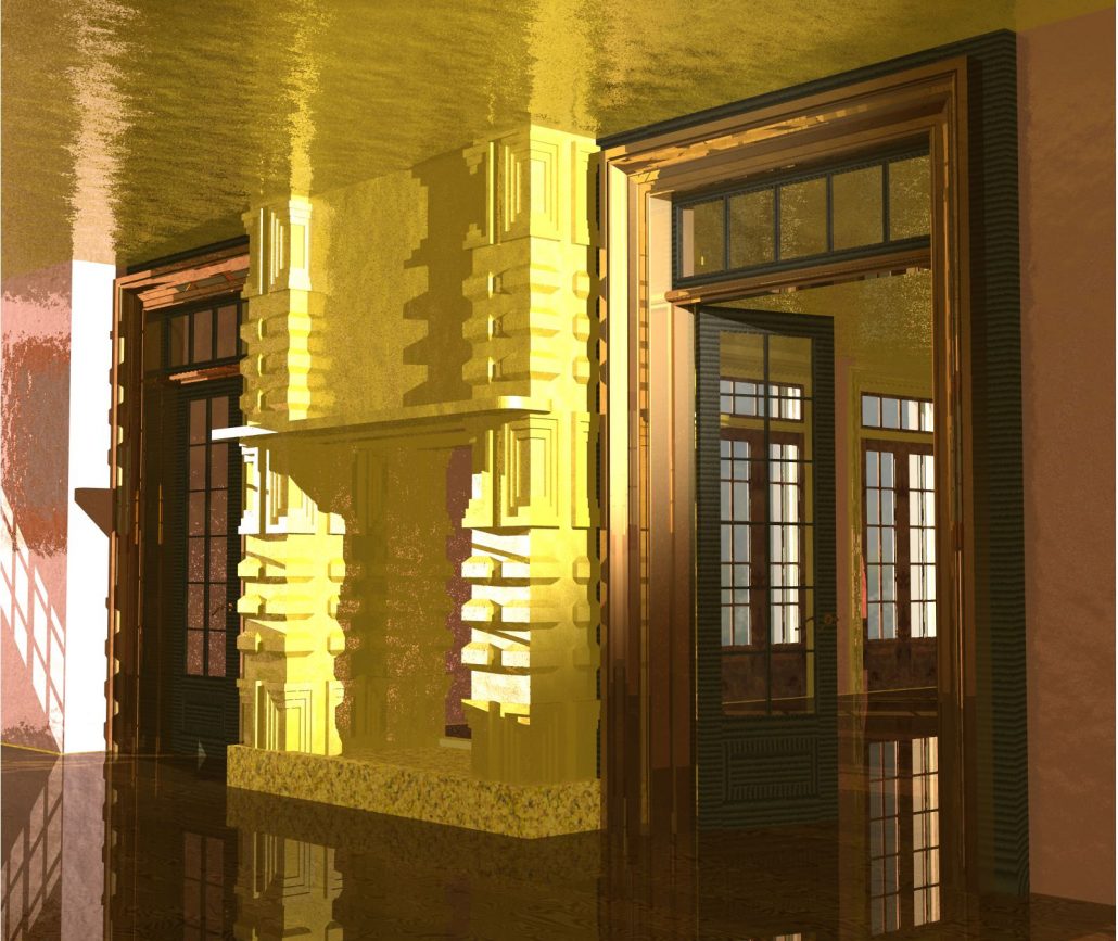
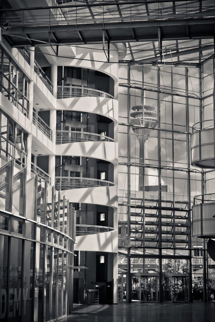
Observe that the three images above are almost white, with only slight departures from the pure white of the paper. As it happens, I love this look and would very much like to develop it in my own photography. One of the finest icons of high-key fashion is of course The White Company, founded by Chrissie Rucker just twenty years ago. I could, and sometimes do, spend hours in that shop (our local one in Cambridge), always trying to understand how such magic can be created from, in effect, the absence of colour.


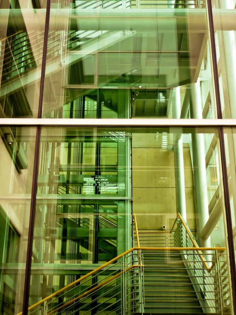
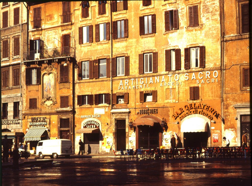
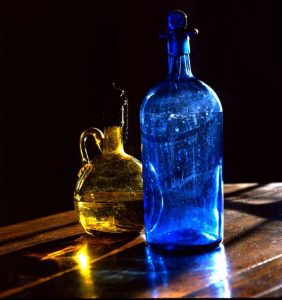
Colour is central to everything I do. Strong, hot, Italianate, Renaissance colour. The intrinsic passion in red and black, blue and gold, soft pinks and vivid apple greens. The power and impact of colour are unparalleled, and one of the misfortunes of living in England is that, almost uniquely in the world, our light is always grey. The image appearing here shows one of those classic combinations, vividly rendered in the exquisite beauty of old glass lit from behind. I took this picture many years ago and it still thrills me.